2020 has vastly accelerated the digital world. As we spent an increasing amount of time at home, we turned online for both work and play. As such, technology has moved apace and the digital realm is becoming an increasingly familiar presence. It is perhaps unsurprising therefore that some of this year’s hottest recruitment website trends involve the injection of realism in some form. We will also see a growing number of websites adopt a sense of calm in their design. From a minimalistic approach to a calming colour scheme, this is a reaction to the tumult that we have all experienced over the past year.
Calm design
2020 was a tough year and the start of 2021 isn’t exactly the shiny, new, restriction-free year we had once hoped for. What many people want is calm, order and simplicity. Web designers are meeting that feeling head-on with soothing colours, minimalism, white space and rounded shapes. Calm colour schemes have the added affect of being easier on the eyes which, given the increased time we are all spending online, is great for user experience. Ultimately, we all want visitors to spend more time on our websites. By simplifying the design and employing soft colours, you’ll make it easier for them to do that.
Interactive elements
We have all craved more human interaction in the past year so why not inject a sense of interaction into your website? With the growing adoption of faster internet speeds, multimedia experiences are increasing. Video, audio, text and images can be brought together for an experience that will truly engage users. However, avoid utilising this too much as it can be overwhelming. Also remember to always use alt text for images and closed captioning and transcripts for pre-recorded video to keep it inclusive. A growing trend is for parallax animation, whereby elements on the page are separated into foreground and background, with the foreground animation appearing to move faster. It adds depth, realism and draws users into the page. It’s important to note that parallax effects can cause dizziness and disorientation in users with vestibular disorders so keep it contained to a small space within the design.
Neumorphism
Last year in an article on website trends we talked about skeuomorphism – a design effect in which objects look and act like their real-life counterparts, e.g. Apple’s rubbish bin for deleting files. Neumorphism was born from skeuomorphism and falls somewhere in the middle of the ultra-realism of skeuomorphism and flat design. Rather than recreating reality, it uses shadow and light to create the feeling that components are emerging from the background. It adds layers and creates depth and the effect is a minimalist design with a sense of 3-D elements. A kind of new, heightened reality.
Design for change
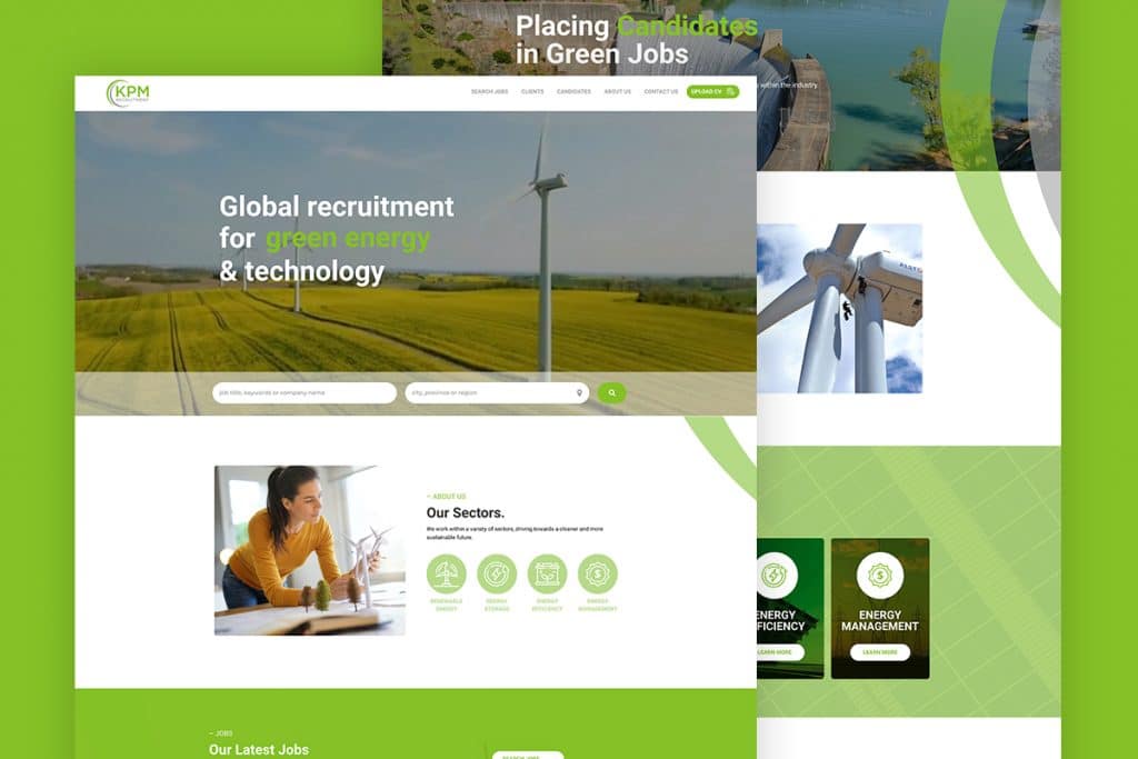
The world was set on fire last year by the Black Lives Matter movement and the events that prompted us all to sit up and take notice. It’s time for diversity to become embedded into recruitment strategies and that should be reflected in your website design too. Think about including images of people from diverse backgrounds in your images. Just as consumers want to see themselves in adverts, candidates want to see themselves represented on your website. The best user experience is one whereby the user feels that shared values are being portrayed.
Saturated colours
Apple’s Big Sur OS has heavily impacted the design world. Rich, almost life-like colours that have a three-dimensional feel will be big this year. It’s another way to add realism to your website, whereby colours take on a life of their own and jump from the page at you.
Scrollytelling
One of the hottest trends for 2021 is scrollytelling, or visual storytelling. The old adage ‘a picture speaks a thousand words’ is the driver behind this design trend. Rather than a ream of text, a series of images (sometimes accompanied by sound, animations and/or brief text) is scrolled through, taking the user on a journey and keeping them engaged. As with all design elements, just ensure that your scrollytelling aids the conveying of information rather than distracting from it.
Horizontal scrolling
This must be used with care as horizontal scrolling to access important information can be clunky. However, employing it to display secondary information enables you to keep that information in a space that is accessible without it taking up valuable page space. A great example of where this works well is on an image, recent blog or portfolio gallery.
Reimagined retro
Many of us are struggling with events of the present so it makes sense that we are looking to the past for design inspiration. Retro typography and imagery evokes nostalgia but rather than losing ourselves in a bygone era, it has been blended with futuristic stylisation for a new take on the old. This is retro-futurism.
Full-screen forms
In the spirit of creating a simplified user journey for website visitors, full-screen forms could be a great option. One of your calls to action will always be the filling out of a contact form. Make it easier to complete and submit by allowing the form to fill the entire page.
Photography/graphics fusion
One way to stand out is to merge graphics or hand-drawn illustrations with photography to create a whimsical blend that can help engage users. A 2020 trend that is growing traction, adding graphics to stock images can bring them to life and be incredibly evocative.
Ultra-minimalism
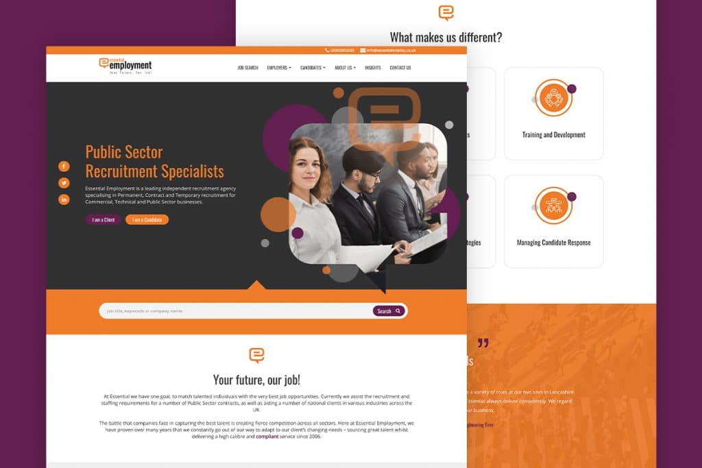
The world is chaotic so inject some calm into your recruitment website’s design with a minimalistic approach. Minimalism has been around for a while but we’re talking extreme minimalism. For example, a homepage with a single image and a logo or a black background with a single call to action in the centre of the page. It may seem simple to create simplicity but deciding what to keep and what to strip away can be incredibly difficult. The result, however, can be cool, calm, easy on the eye, and stylistically beautiful.
Many of the recruitment website design trends for 2021 have inevitably been influenced in some way by the events of 2020. The message is to ensure your website is inclusive and accessible, easy on the eye and the mind, engaging and evocative. And of course beautifully designed.

