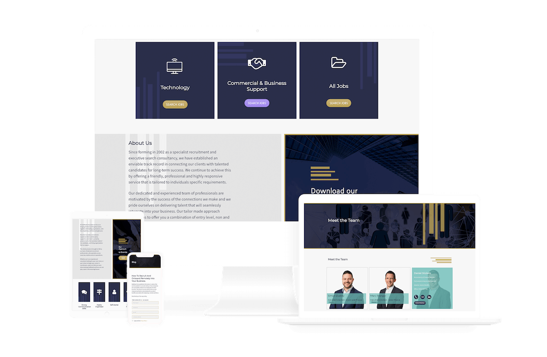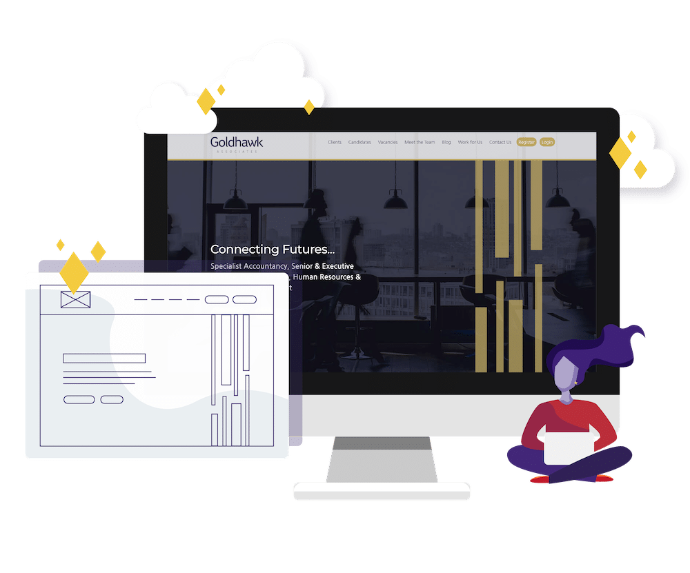
Our designers took the branding and style from Goldhawk Associates’ previous website and extended it, taking the navy and gold colour scheme and creating a more personal brand style with a dynamic vertical lines asset through the side. These lines create a sense of movement throughout the website, guiding the user through and establishing a feeling of strength and conviction. To distinguish the various sectors in which Goldhawk recruits, each has its own colour identity which is consistent throughout the recruitment website design.
